Zine // 2019
OVERVIEW
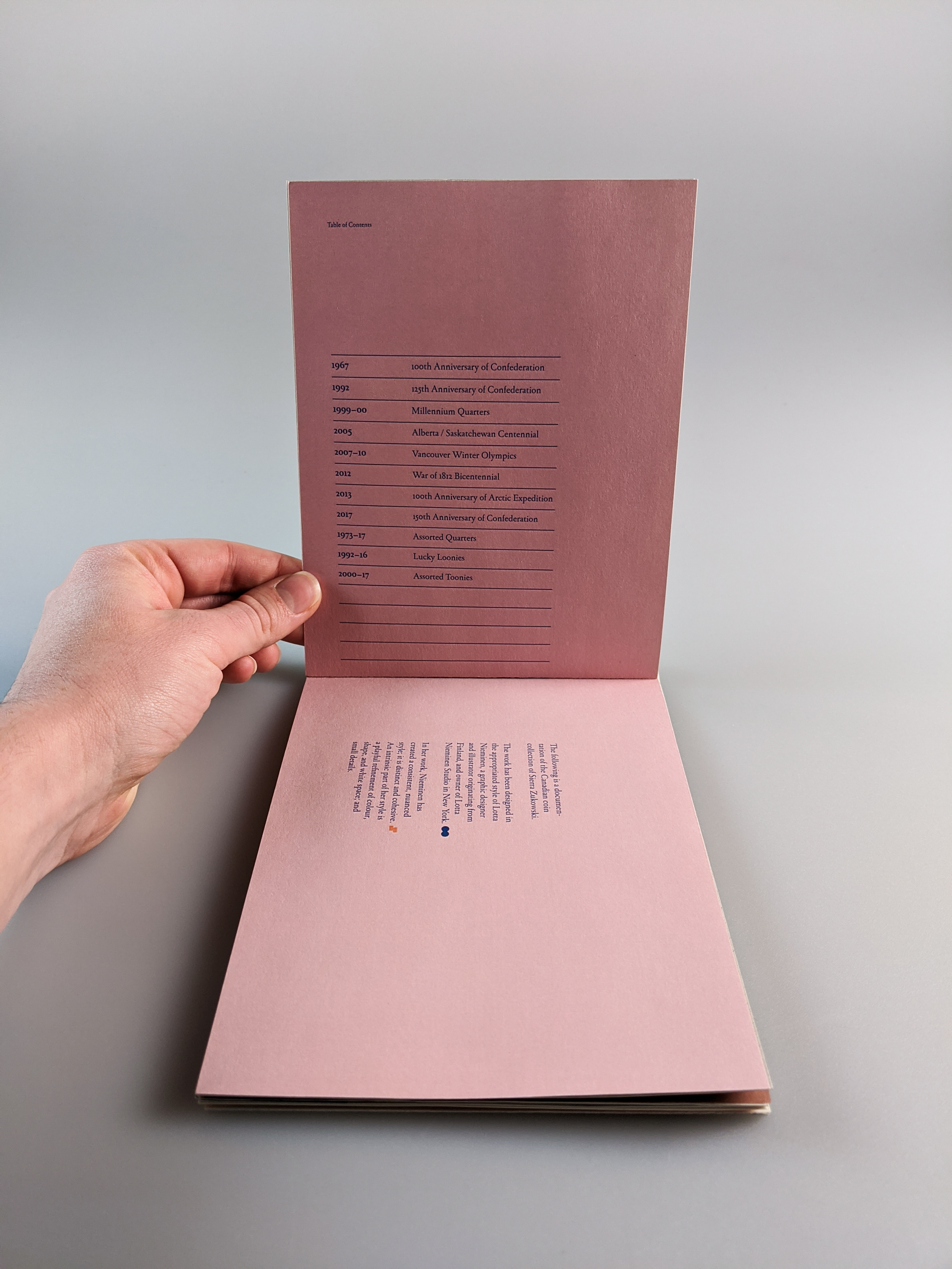
An underground zine designed in the appropriated style of Lotta Nieminen. The subject of the zine is my Canadian coin collection.
*DESIGN PROCESS BLOG
*TAGS // Student, Graphic design, Publication, Print
An underground zine designed in the appropriated style of Lotta Nieminen. The subject of the zine is my Canadian coin collection.
*DESIGN PROCESS BLOG
*TAGS // Student, Graphic design, Publication, Print
PROBLEM
Conceptualize, design, and produce an underground zine.
After choosing the subject of my Canadian coin collection, I had to present the information in away that made coins something my peers wanted to look at and learn about.
Another problem was figuring out the logistics of indie publishing a small run of my zine.
SOLUTION
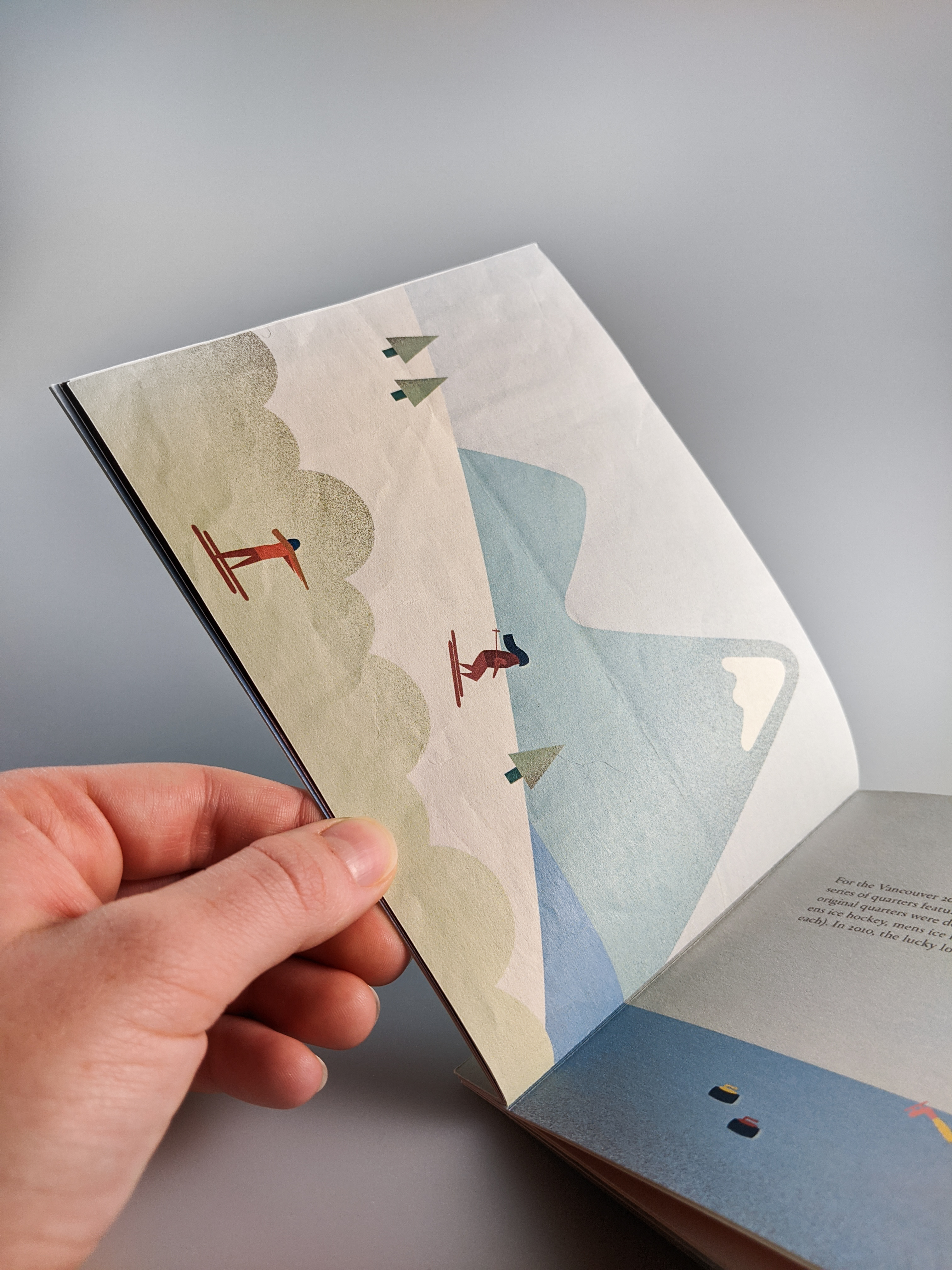
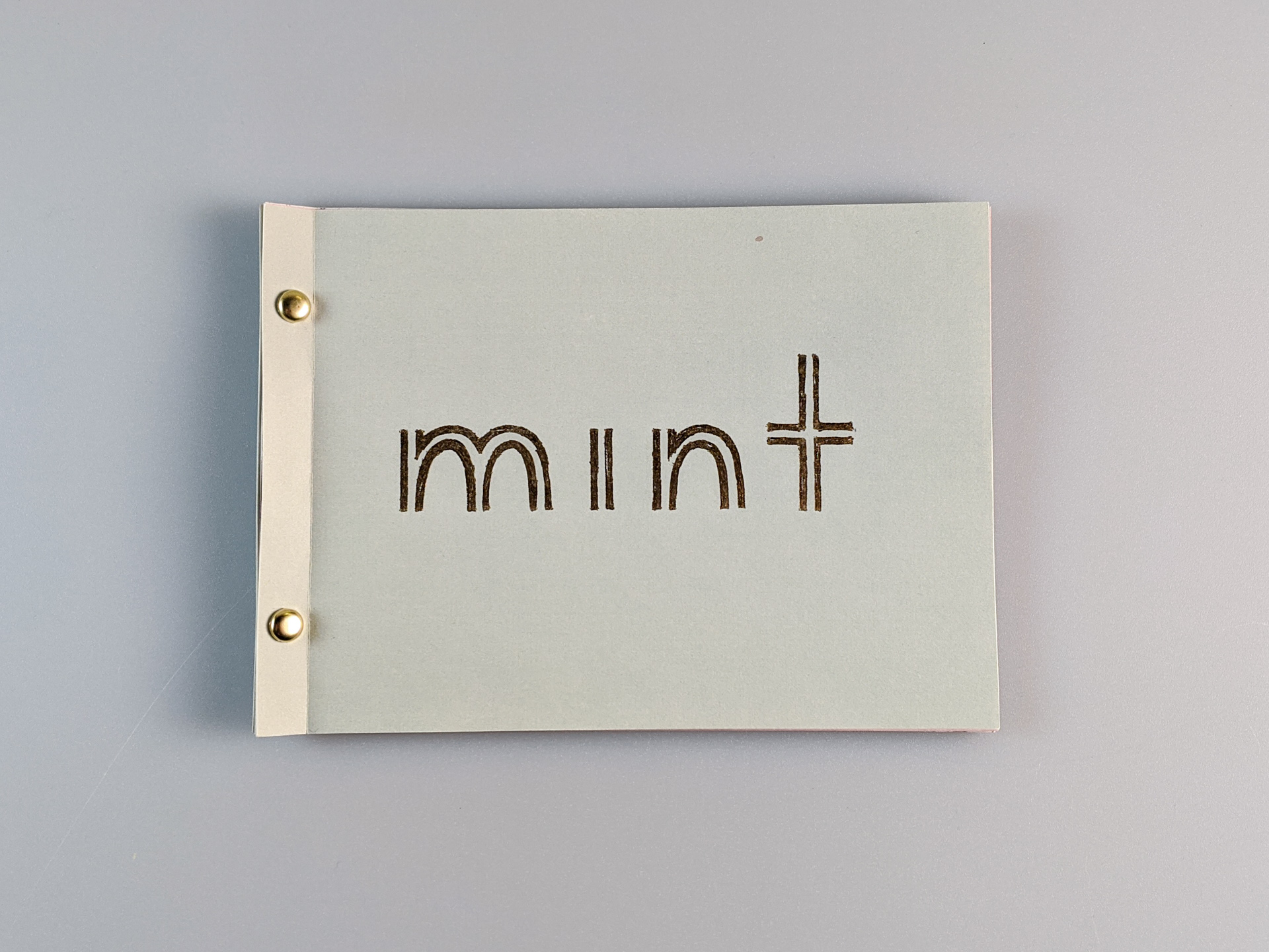
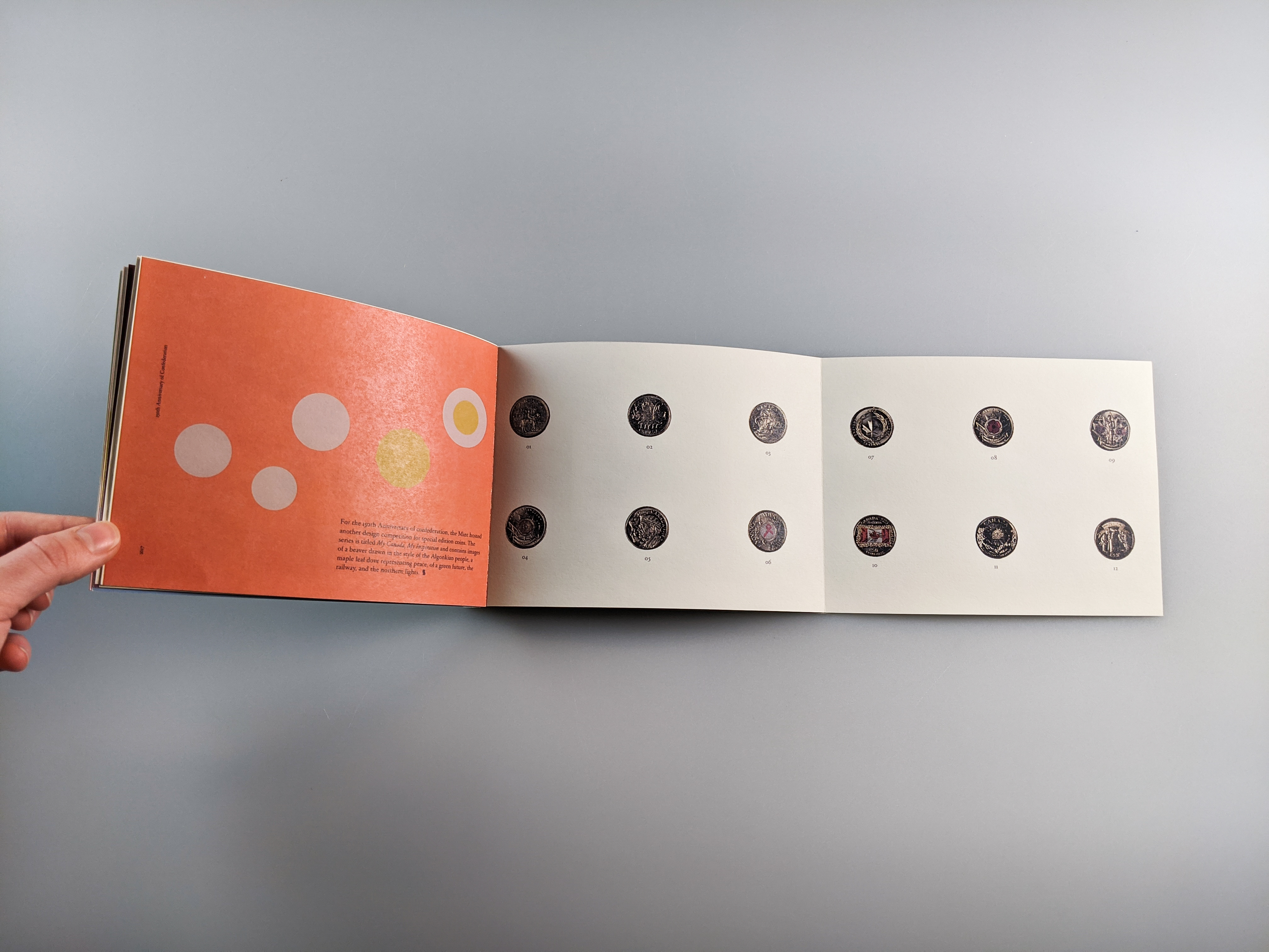
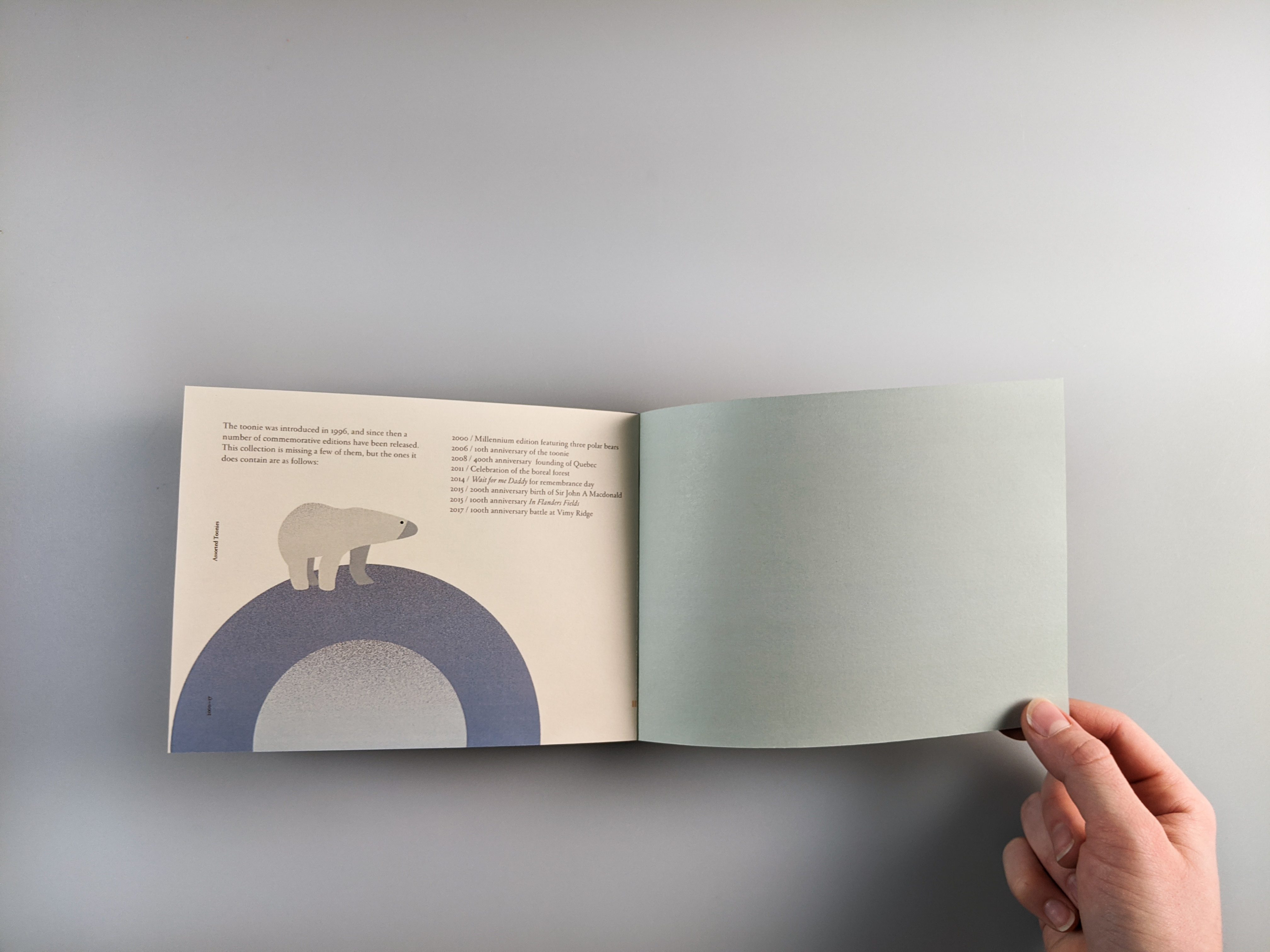
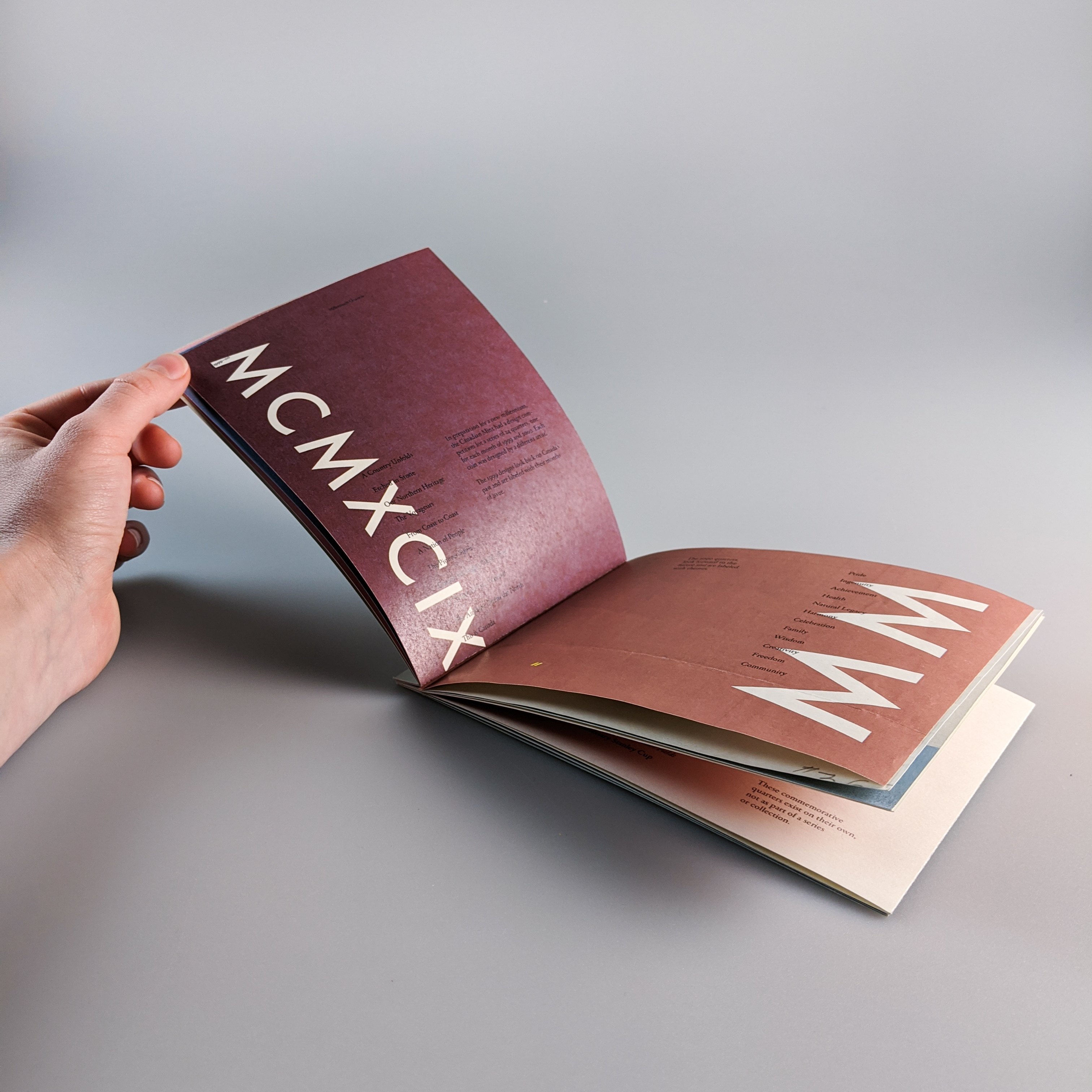
To create visually interesting layouts, I combined illustration, graphic design, and typography. I found connections between Nieminen’s projects and my subject matter to add meaning. For example, the title of the zine, Mint, is a play on where coins are made and one of Nieminen’s design projects that uses the colour mint and similar type to what I used. This clever polysemy is found throughout the zine.
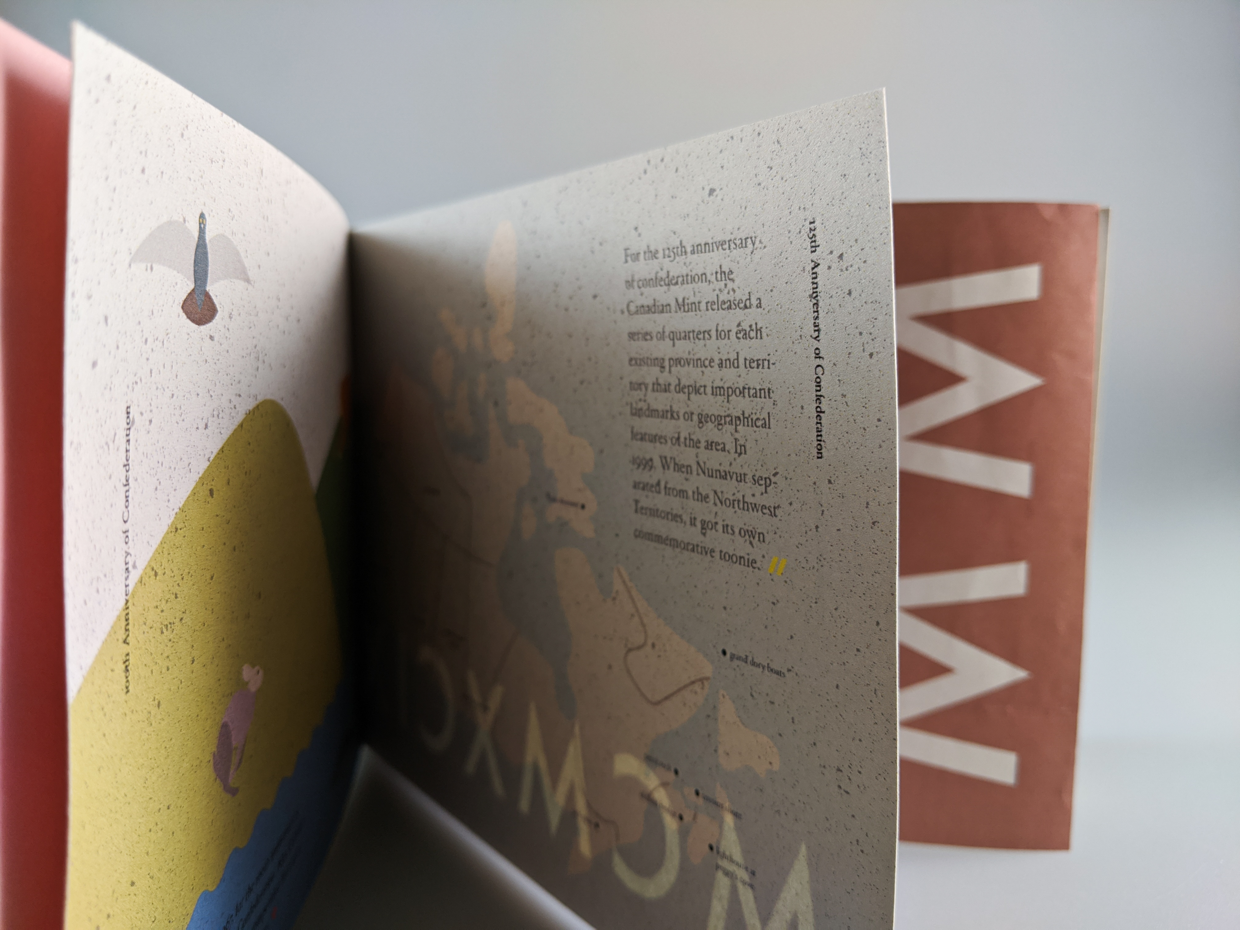
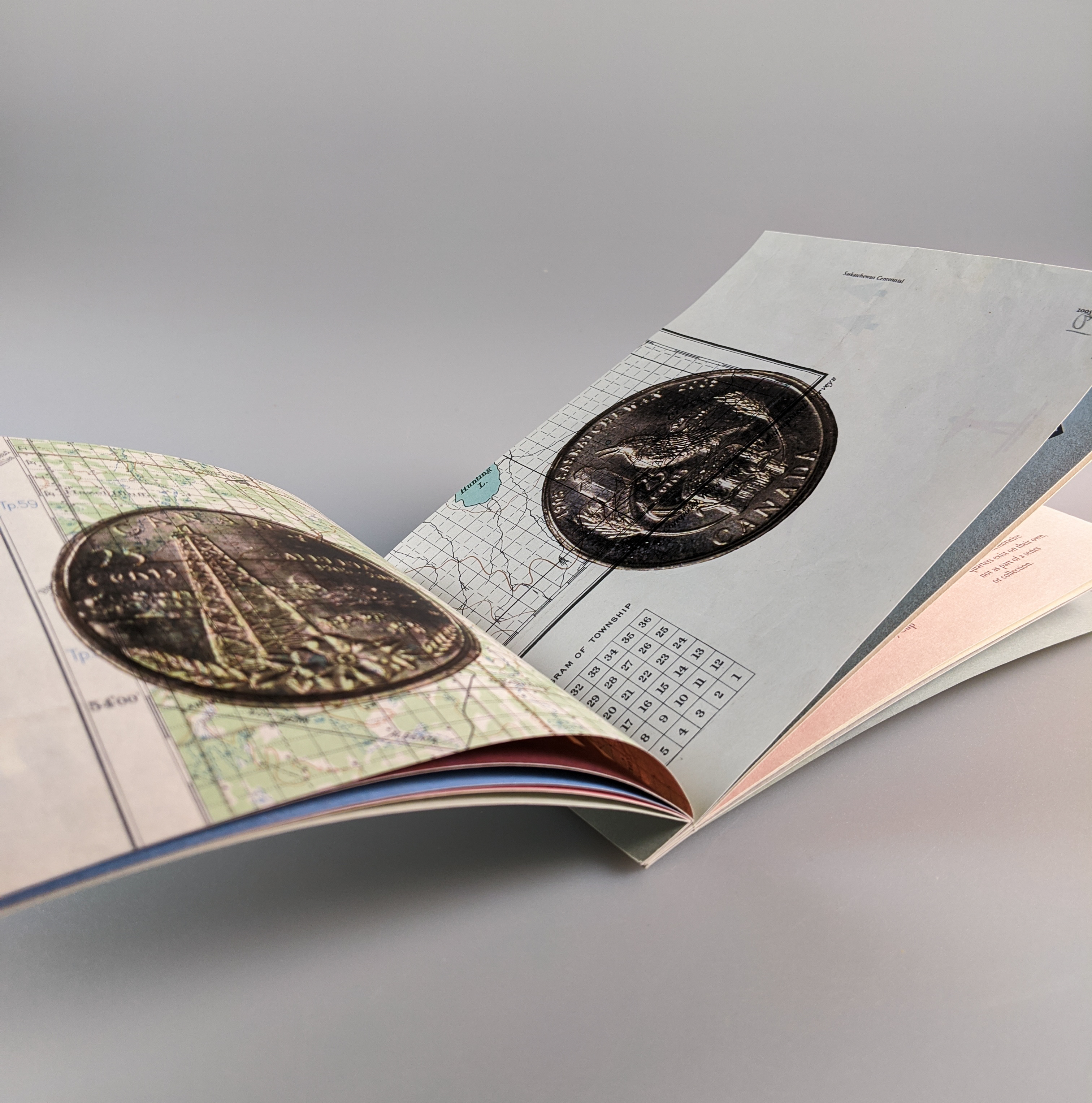
For production, I printed on old sketchbook paper with two pages in each book on old maps that, relating to the coins displayed on them. The zine is bound with gold fasteners that mimic the shape and colour of coins and allow for pages to be added as the collection grows. Gold foil appears in places as Nieminen uses foiling a lot in her work and the material resembles the metallic shine of coins.
To create visually interesting layouts, I combined illustration, graphic design, and typography. I found connections between Nieminen’s projects and my subject matter to add meaning. For example, the title of the zine, Mint, is a play on where coins are made and one of Nieminen’s design projects that uses the colour mint and similar type to what I used. This clever polysemy is found throughout the zine.
For production, I printed on old sketchbook paper with two pages in each book on old maps that, relating to the coins displayed on them. The zine is bound with gold fasteners that mimic the shape and colour of coins and allow for pages to be added as the collection grows. Gold foil appears in places as Nieminen uses foiling a lot in her work and the material resembles the metallic shine of coins.
OUTCOMES
Four copies Mint were produced, each of them printed, trimmed, bound and foiled by me.
Four copies Mint were produced, each of them printed, trimmed, bound and foiled by me.
Mint zine details